Description
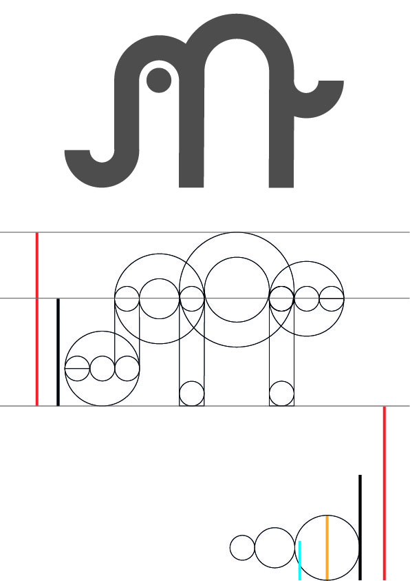
This website needed a logo, so I made one. At first I wasn't sure what this website would be called and so I tried all sorts of stuff with the logo. Eventually I went with "roelifant" since that was a nickname of mine that was already in use. The logo is a simplistic depiction of an elephant, resembling a curved letter or symbol of some sorts. The proportions are inspired by the golden ratio.
Process
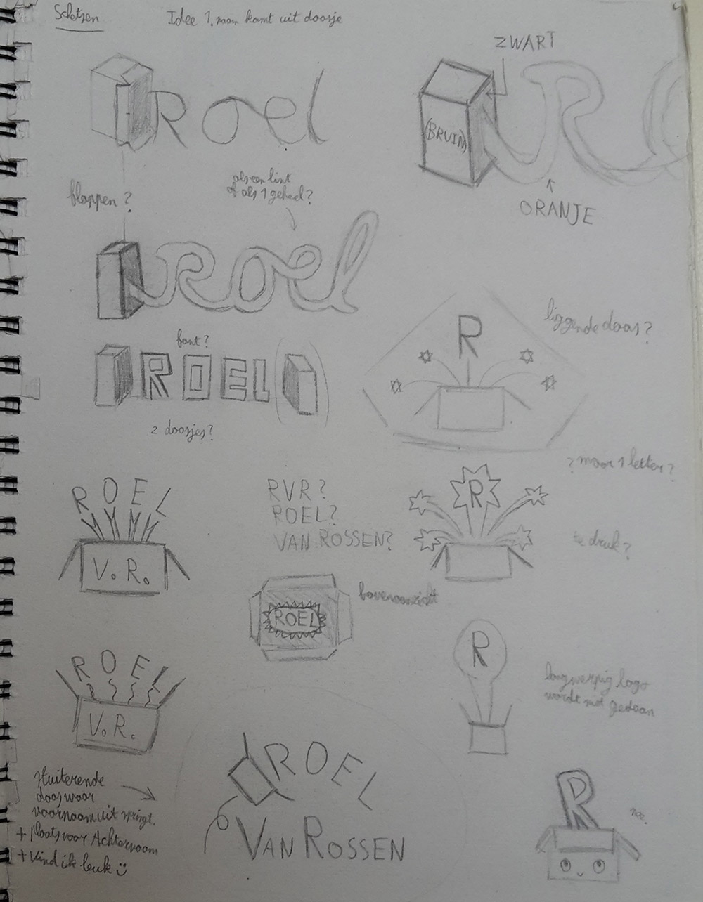
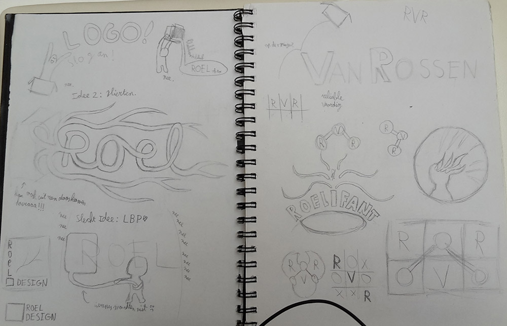
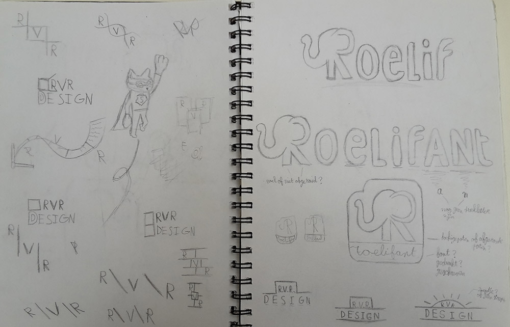
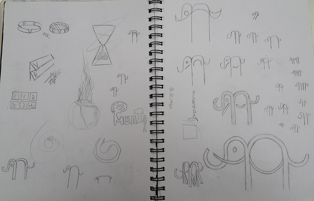
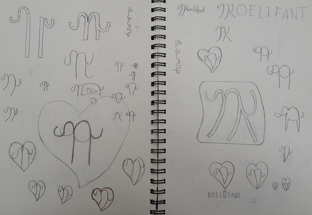
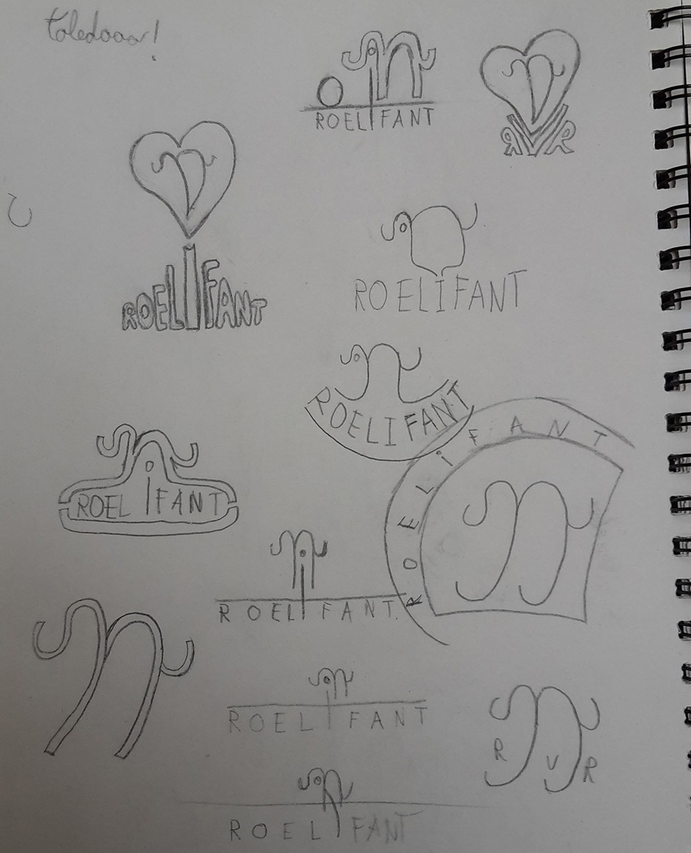
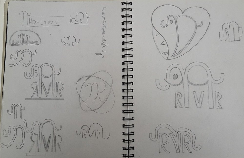
I made many, many doodles before I finally settled on an idea for this logo.
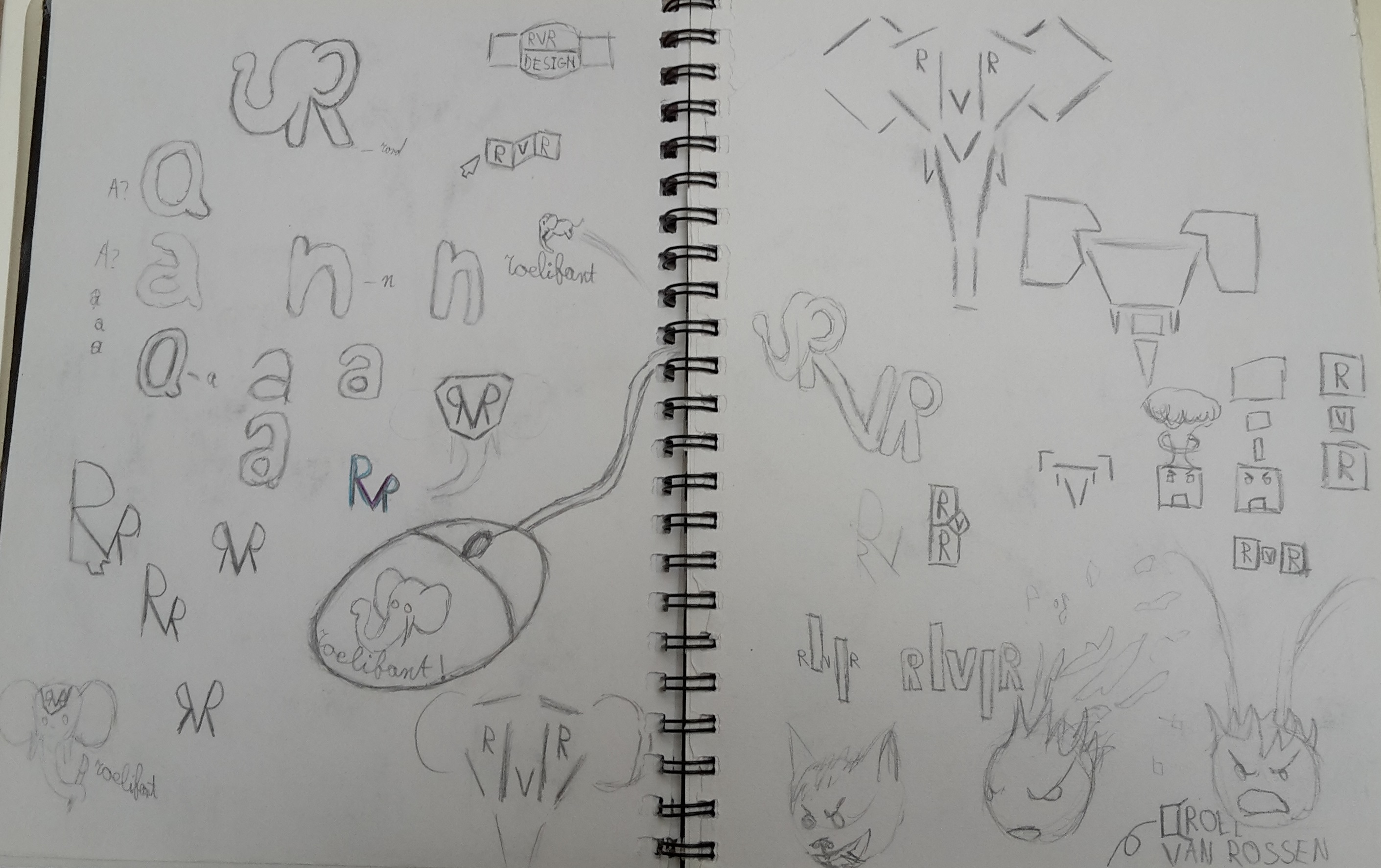
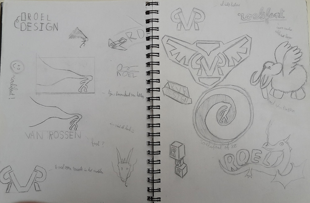
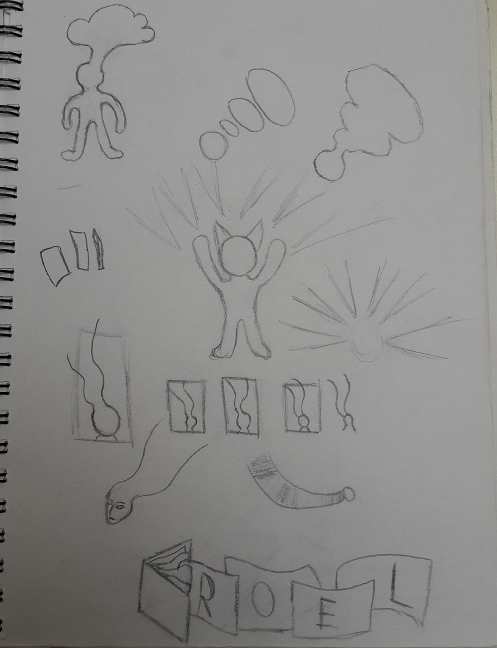
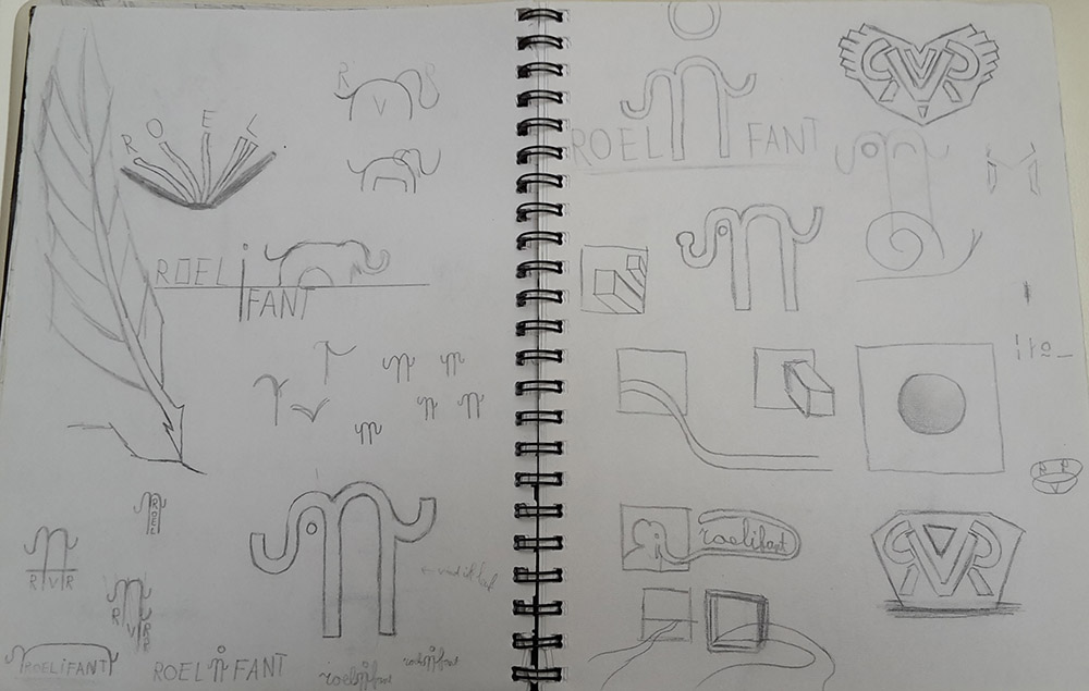
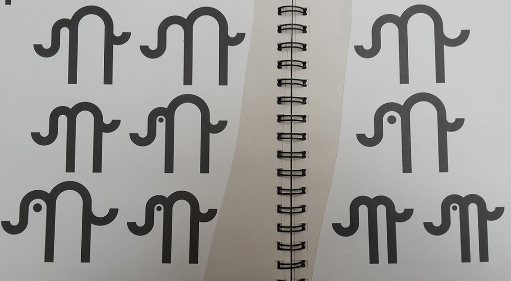
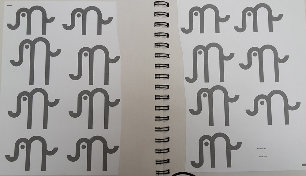
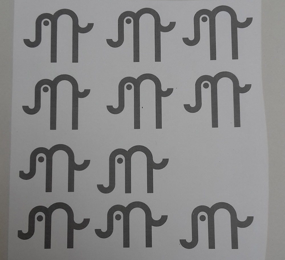
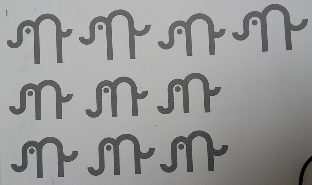
Once I settled on an idea, I switched to illustrator to make a bunch of different elephants and experiment with the proportions and placement. I was using the golden ratio but even when you do that there's still a lot of wiggle room left and many decisions to make about what part gets what propportion. In this phase I finally decided to add the eye. Another big decision was whether the trunk should be lifted, or if it should be "on the ground". It ended up on the ground.
All this resulted in the following logo:
