Description
There was a tiny organisation in Mechelen that needed a logo, and so Thomas More's Interactive Multimedia Design started a competition among its students to create that new logo. This was my entry. It received some praise but sadly it didn't win the competition.
Mechelen Matcht is all about organising activities to bring lonely people together. Despite the name it wasn't officially associated with the city of Mechelen, and so we were discouraged from using iconography or symbolism from Mechelen. I chose to focus on the organisation's initials, and the ideal they strive towards of bringing people togetherness.
Process
From the start it was clear to me that this logo had to be two M's that looked like a group of people, but there were many ways to go about it. I played safe going with my usual approach of creating archs and using the golden ratio, because frankly it always gives nice results.
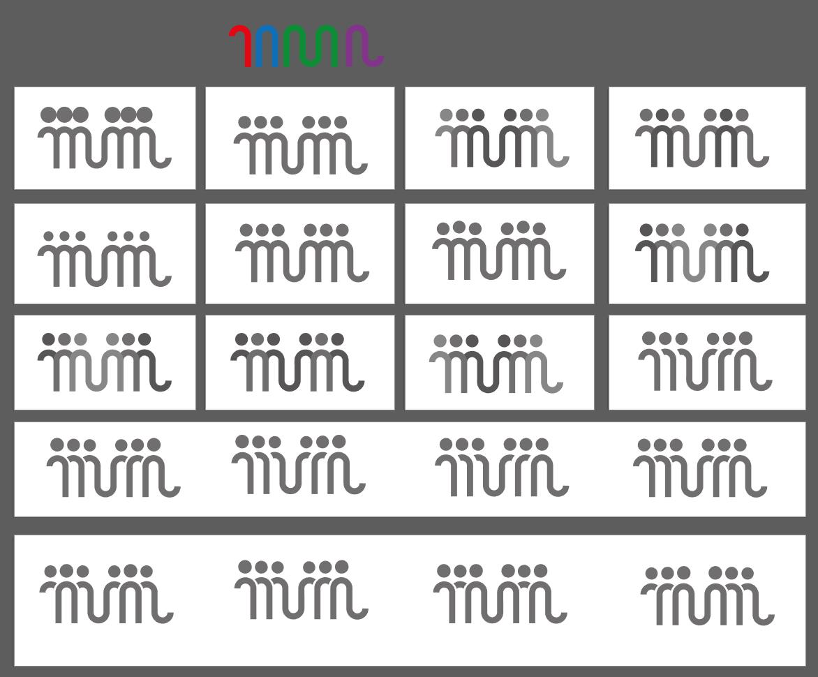
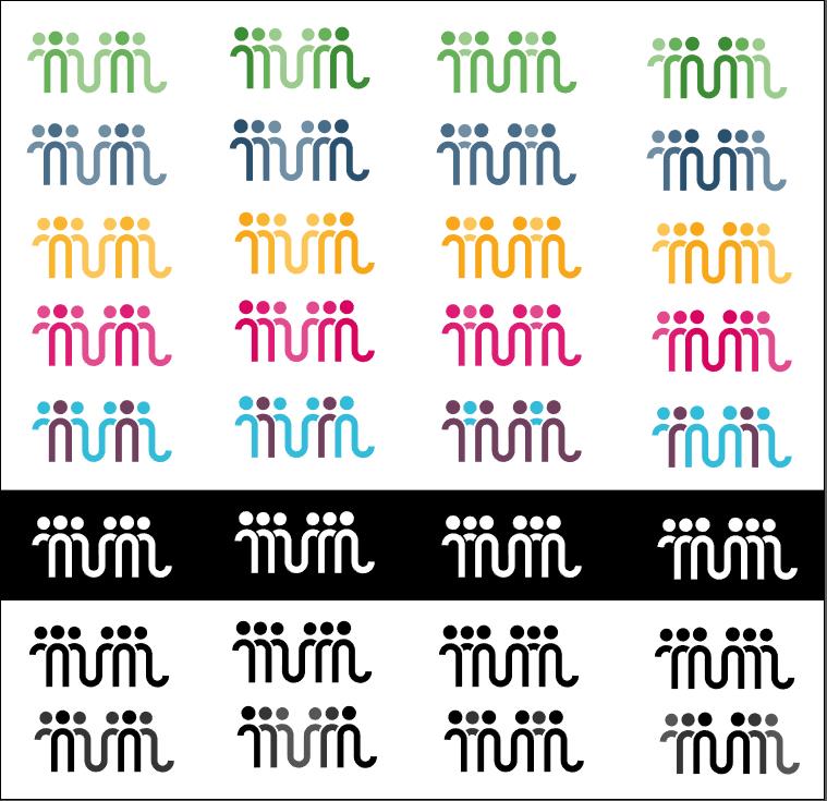
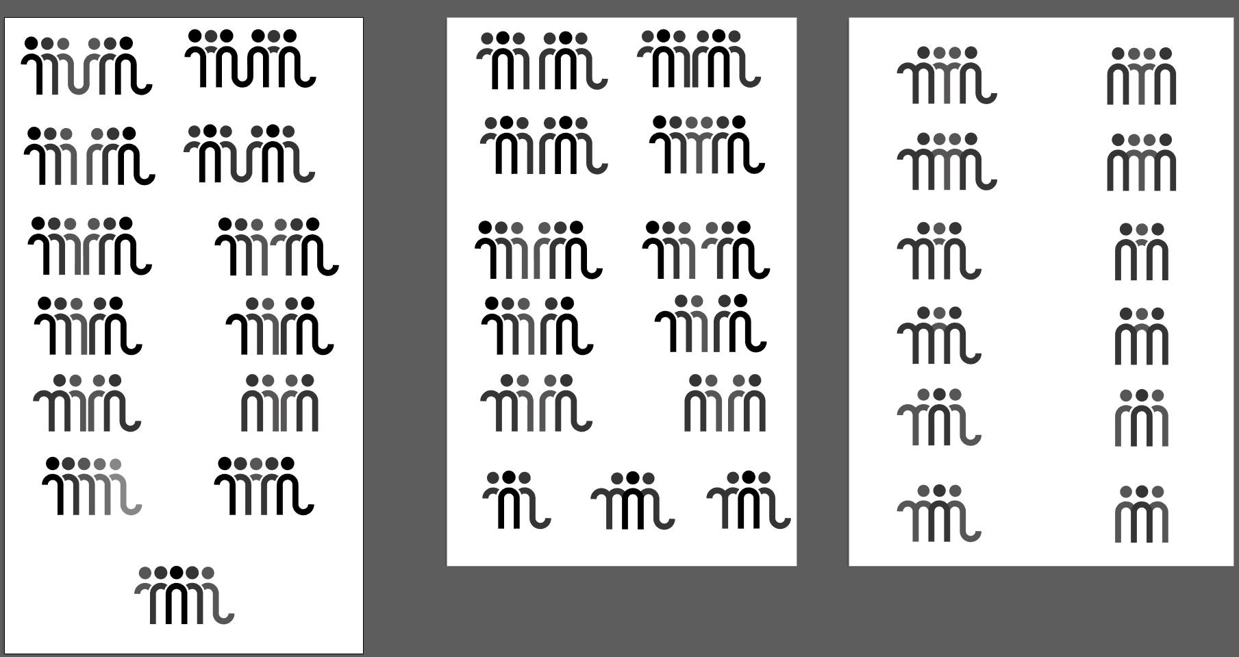
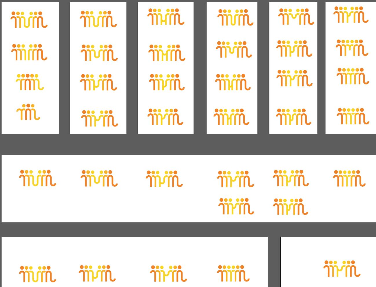
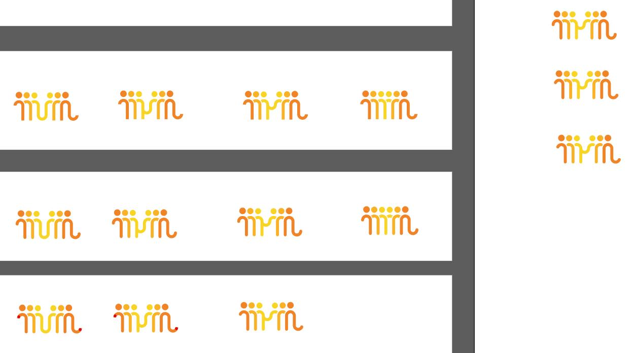
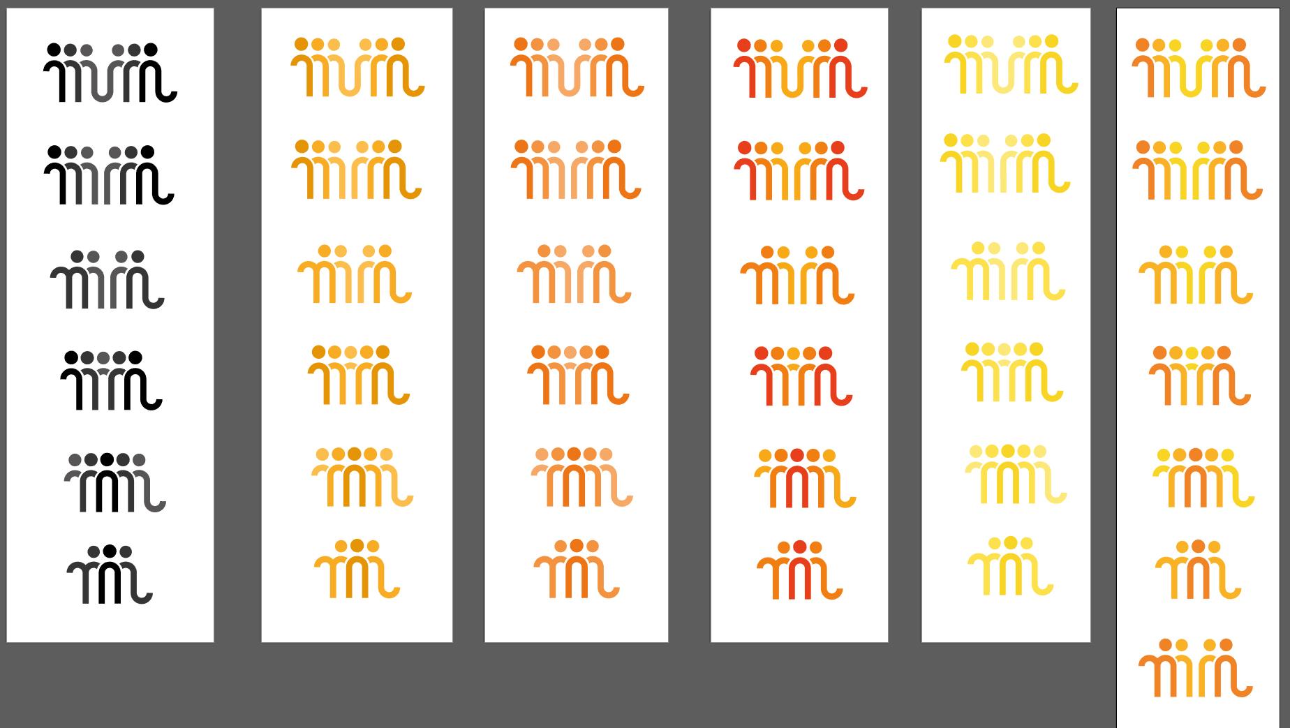
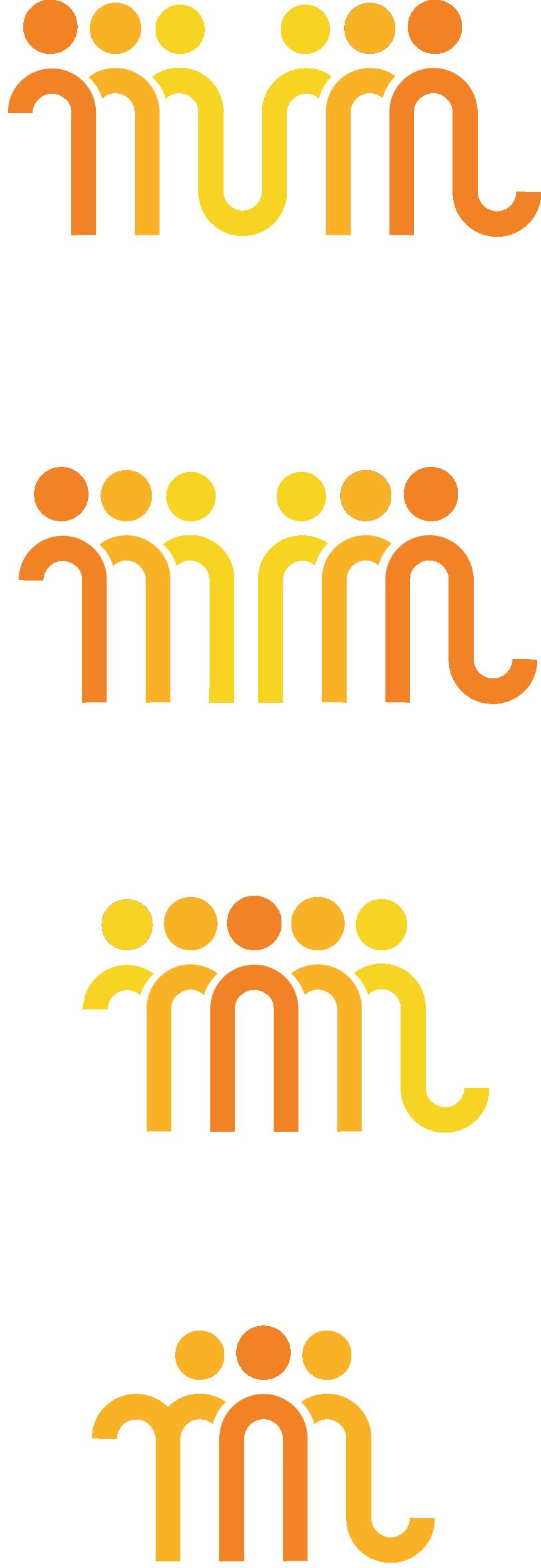
At the last moment I decided to round the corners, figuring it would suit the playfulness of the organisation better. I also made a "connection" between the two M's because I felt like the big distance between the two M's - or the distance between the two groups of people - didn't represent the message very well otherwise.